This is a theory of mine: the problem with drivers in the US is our road signs: they have too many words on them, and our population’s declining literacy levels are making this a challenge for compliance with the posted placards.
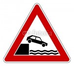
I lived in Germany for a while, where the Vienna Convention on Road Signs and Signals holds. Vienna describes a group of symbolic signs nearly devoid of text that control the safety aspects of roadway behaviour in the EU and other areas of the world agreeing to the convention. Notable in not agreeing is, of course, the US. I found that after a period of adjustment, the signs were easy to interpret and that I could respond almost instantly to them, because visualization was all that was required. I did not have to process them. Well, “no parking” and “no stopping” took a while to sort out, but hey, who is perfect? By the way, do not drive your Volkswagen Cabriolet off of the dock and into the river. You will likely get wet.
A typical Vienna convention sign has a ground color, an accent color, a shape, and a symbol. For example, the speed limit sign is circular (command) with a white ground (information) with a red outer ring (prohibition) and a number in the middle (actual speed limit). A parking area sign is square (informational) with a blue ground (permission or recommendation) and a white P (parking area designation). All of the signs follow a few rules and language independent. Two faves are these, which are actually related.
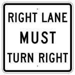
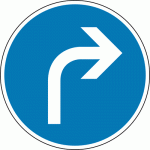
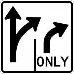
For example, consider the signage on the south side of the intersection of Coolidge Highway and Big Beaver Road in Troy, MI. The right lane must turn right, and is signed as such. Compare this to the Vienna sign, which is a simple blue circle with a white directional turning arrow.
A few of our colleagues have gotten the point, and signs like this one are starting to show up. The arrows require little to no processing to understand, and the only is completely superfluous, likely a throwback to the wordy original.
I could go on at length with comparisons, but I think you already get the picture (pun wholly intended).
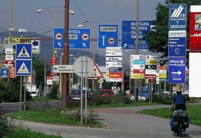
So, why am I bothering about this? My older son is taking his introductory driving course here in MI this month. He’s learning about road signs and such, and he’s noticed the peculiarities of our wordy signage already. One is something the Germans call the “Schilderwald”, or forest of signs. It happens when a large number of signs are erected close together. Examples in the EU are numerous, and typically hilarious as the signs often conflict with each other. It is not unusual to find people taking photos, a non-trivial number of which will be used to contest traffic citations.
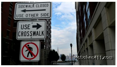
In the US, we persist in using signs with words on them. In English. Imagine a Schilderwald using our signs, and how long it would take to read all of them. The pictograms are enough work! Thankfully, this mess is only for pedestrians, who have time to stop and process it.
So, let me get up on my soapbox here and argue for conversion to the Vienna Convention. It would make life easier, better, and much more fabulous, being that everyone would have a shot at driving sanely, regardless of their literacy level. Imagine a US where everyone can interpret the signs and follow directions. Where even the most distracted texting driver has to only look up from their phablet for half a second to catch the sign, know what it means, and do what it shows. Where reading of road sign text will never more distract anyone from the road, or whatever the heck it is that they are doing on it. Paradise is what it would be.
At the same time, maybe we could finally convert to metric, too? Please? They already have the signs for that made up.
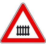
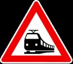
About the two signs at the top, which I playfully call the caterpillar sign and the picket fence sign. The caterpillar sign indicates an ungated railroad crossing. And, you guessed it, the picket fence indicates a gated one.

